When starting a project, you want everything to be perfect, but there is one question left unanswered: how to pair fonts?
Fonts are a great way to stand out from the crowd and to show your personality in your brand. However, using randomly chosen fonts may result in a cluttered and inconsistent design. It’s a matter of conflict. Some fonts pairing will look amazing together, while others repel your potential clients. There needs to be a balance.
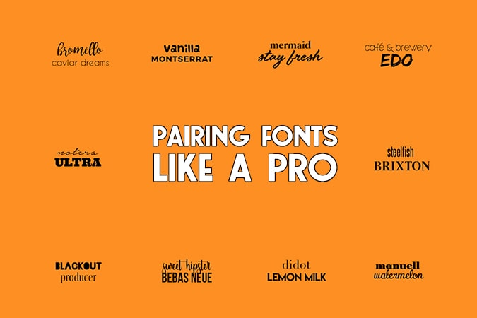
Lucky for you, we’ve collected eleven golden rules for you to help you out. In general, fonts usually pair well when there is a contrast between the two types, but we’ll go deeper into the subject in the rest of the article. Enjoy!
Table of Contents
Pick a pair from the same family
This method may be the easiest way to create a perfect font pairing.
Font families are here for a reason. They classify similar types of fonts that complement each other. Examples of these families are serif, sans serif, cursive, monospace, and fantasy. When you stick to the same family will help your work look cohesive and also narrows down your choices.
However, when choosing a family, pick the ones that have different style options. Having a font family with a vast range of sizes and cases will spice up your design even more!
Be like Laurel and Hardy
Thick and thin. Like mentioned before, when there is a contrast between two fonts, they usually pair well together. In this case, the distinction lies between the weight of the font. A thick, stout font often matches well with a tall and skinny one.
This great combination is because each font plays a different role in the design. It’s also easier to distinguish the two meanings. Both types create a complimentary design and carry their weight of serving a different purpose.
Loose and tight kerning
As mentioned in an earlier article, kerning is the spacing between letters or characters in a typeface. Using different kerning spaces is an excellent way to show variety in your text. It creates a particular hierarchy and opens up the opportunity to get creative. However, don’t be too creative as too tight or too loose kerning may mess up the look and repel interested readers. Sometimes kerning will also make two letters look like one. For example, an ‘r’ and ‘n’ will look like a ‘m.’
Choose font pairs with different kerning spaces to balance out your design.
Complementary moods
This method is more subjective than others, but there is a reason some font combinations “feel” better than others. It’s like you just know what looks professional and what doesn’t.
To give an example: when you are writing an essay, you won’t hand it in with a WordArt title and a Comic Sans body. It just doesn’t feel right. The same goes for using a super formal font for a birthday invitation.
So, when you are picking typefaces, try to pick two that have the same mood. While they might look different, they will help to convey the message you are trying to send.
Go for Serif and Sans Serif
Serifs have so-called “feet” at the bottom of a letter stroke. Their official name is “decorative flourish.” Sans Serifs are without feet. Hence the sans.
When pairing different typefaces, try to combine a Sans Serif with a Serif as they create a big contrast between the two. Still, it’s also essential to make sure that the fonts have different sizes, weights, and styles to prevent a boring design.
Pair a traditional and decorative font
With fonts pairing, it’s easier to assign categories or roles to them to establish a type of hierarchy.
You want your headings to catch the eye of your reader. So, this one has to stand out from the rest of the text. Therefore, this typeface is usually large in size and weight. It also sets the tone of the body; a formal heading notifies the reader that it will be a serious text.
Then, when you contrast the heading with a decorative body, it will generate a higher appeal to your readers. This appeal keeps them interested longer and helps them to finish reading the entire piece.
Go for a decorative heading with a formal body
You can also go the other way around! If you’re working on something more light-hearted, fun, or festive, you may want to set the tone beforehand. Picking a festive header will help you with that.
Think of all the blogs you’ve read. How many of the “fun” blogs used a festive heading? The chances are that 9/10 did so.
The festive header helps to catch the eye while the formal body helps to make your text more readable.
A small piece of advice: using a decorative header works best when your headline is short.
No similar fonts
I can’t be clear enough about contrast! It should be your focus when pairing fonts. Therefore, the pairing of Serif and Sans Serif go so well together (in Tip number 5): they have contrast.
If you’re not sure what elements you should consider when looking for contrast in pairings, here are some characteristics you can search for:
- Size differences (big and small go well together)
- Weight (thick and thin)
- Color (Black and white are the most obvious, but purple and yellow, blue and orange go well together too)
- Spacing (A tight-spaced header with a wide-spaced body or the other way around)
- Style (A formal header with a youthful body)
When do you know when a pairing is too similar? Well, the answer is quite simple. If you can’t tell the header and the body apart, they’re too similar. Therefore, fonts that are too similar in their sizes, weights, and style will not pair well together as you can’t tell them apart. The overall effect isn’t as pleasing to the eye, either.
Don’t pair fonts that are too diverse
While you shouldn’t use fonts that are too similar, they shouldn’t be too different either. Contrast is essential, but too much variation can cause typefaces to be incompatible with each other.
Of course, the easiest way to detect whether or not two typefaces pair well together is with the naked eye. However, when you want to tick off a box, you should look at typefaces that have elements in common.
To elaborate, this means that you can pick two thin fonts which have different weights or sizes. Their style is similar, but there is still contrast.
Don’t clutter
Just like you probably don’t like living in a mess, people don’t like looking at a cluttered design. To prevent this, you can stick to the “three typefaces rule.” It creates a balanced design.
Of course, some rules should be broken. However, this rule is not one of them unless there is an excellent reason to do so. A kid’s birthday party invitation may need a LOT of different fonts since it appeals to younger kids. Still, in most cases, you should stick to three fonts only.
Don’t rush it and take the time to look at different typefaces to find the ones you want to use. Ask yourself what appeals to you the most and how it can benefit your design. You need to convince yourself first before you can persuade your readers.
Make it legible
The goal of typefaces is to make your design appealing, visually pleasing, and to encourage your readers to read further and scroll through your website. Fonts enhance your content.
Therefore, if your audience can’t understand what you’re trying to say, all was for nothing. It’s essential to check how well fonts pair together and how visible they are on mobile displays as well as business cards.
Conclusion
Now you’ve learned how to pair fonts, how to find appealing pairs, and how to use them. It’s time for the next step: get started on your project! Have fun and good luck!