![]()
While non-designers may think otherwise, creating a logo is not as easy as it looks. A professional often takes all kinds of aspects into account before creating a concept. And even then, the usage of colors, fonts, and other elements requires strategy. A logo aims to please the human senses. This aim is why the psychology of colors is so important in the creation of logos.
Table of Contents
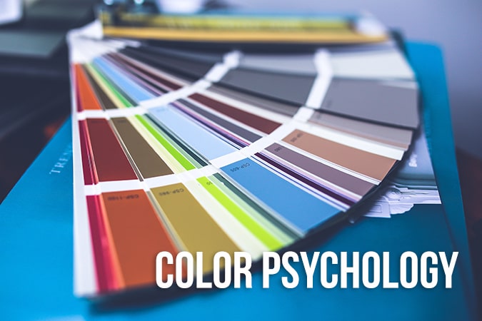
The Color Psychology Behind Logo Design
The reaction people have to the design is one of the primary considerations of the professional when creating a logo. Many people will judge a concept based upon their prejudices. Therefore, it’s essential to make use of the color psychology and shapes behind the logo creation process. Many designers overlook the psychology of logo design; they merely make use of different color schemes and styles. However, designing a logo brings so much more to the table.
‘Logo Creation’ is often associated with the process of creating an identity for a company. So, what’s the psychology behind it? It’s about more than just the brand’s identity. It’s more about the purpose and meaning of a logo. In this article, we’ll teach you some new aspects of the psychology behind the branding design progress.
Logo Creation Psychology
To be able to deliver a lasting impact on your audience, it’s helpful if you’re familiar with the psychology behind shapes, styles, and colors. Every single characteristic of a logo adds meaning to it. The word logo comes from the Greek word “logos,” which means “word.” Therefore, the designing process of a logo is creating a visual identity for a term that describes your business.
Studies from all around the world have shown that people connect with logos as they would with their perspective. So, when people from different academic backgrounds interpret different meanings for the same word, your logo will most likely also be interpreted differently.
Carefully looking at each characteristic of your trademark to make sure its meaning stays intact is the way to go. The more time you reserve to looking for the right definitions to pair with your logo, the more ease you will have with spreading your message across different groups of people.
Psychology of color in logo design
The meanings behind colors often get overlooked by both clients and designers because of the plethora of colorful schemes online. In addition to that, some clients will absolutely want to use yellow or blue without knowing the effects these colors have on their logotype design. This missed knowledge leads to failure when trying to capture the imagination of the audience.
It’s essential to understand that colors contain meaning and that they have the power to empower even the most simple looking logos. But picking a color just because it corresponds to the image you have can make your logo look bad. It’s crucial to pay attention and do your best in selecting the right type of scheme and shading (where needed) to create a successful design.
Different colors correspond to mixed emotions. Take the color ‘black.’ This color is often associated with mystery, death, sophistication, and power. White, on the other hand, stands for purity, life, goodness, and hope. Red expressed love and romance, but also anger and passion. Blue stands for confidence, peacefulness, and integrity. Lastly, grey’s associations are authority, stability, security, and maturity.
Before using various colors in your design, make sure that you know the psychology behind them.
These are some of the more common colors and the psychological impact they have on your audience.
· Blue
Many famous business logos are blue. Look at Facebook and Twitter, their primary logo and webpages use the color blue. Other companies like Samsung, HP, and Pepsi use blue in their logos as well since it has a calming effect on people.
However, calm is often not the reason for using blue in the design. Blue, namely, also spreads the idea of success and confidence. It has no negative associations, which makes it a safe color to incorporate in any kind of design.
· Black
When you look at it from a psychological perspective, black is known as an intense color due to its connotations to power and strength. If a company wants to show that they are the best in their niche and powerful, they will use black. This creates a feeling of authority. Nike and Chanel are companies that use black.
· Grey
Grey is a very versatile color, making it easy to use in combination with other colors. While it may evoke a bit of a cold feeling, grey is a very neutral color radiating modesty and authority. Because of that, designers often use grey instead of black in their designs. Many influential companies, like Apple and Homewood Suites, use grey in their logos and business cards.
· White
The thought behind the color white is that it stands for purity. Many professional designers choose to use white to evoke feelings of perfection, simplicity, and innocence. However, white on its own may be a bit plain, so try using it in combination with other colors to reflect your brand’s personality.
· Green
Green is a natural color, and psychologically it stands for health and earthiness. Due to this, the color has a wide range of emotions associated with it. Green reflects renewal, but also safety, peace, and respect. Ecological companies often use green to signify their connection to nature, and so do hiking/camping gear companies. Computer software brands and sports brands and teams may add a dash of green into their design.
· Brown
Brown promotes warmth and an earthy feel. It’s often associated with wood and stands for simplicity and harmony. However, brown also shows responsibility and seriousness. Because of that, you’ll notice that many law firms, real estate companies, and construction businesses have incorporated brown into their logo crafting process.
· Yellow
Yellow is a prominent color, making it a natural tint to use in traffic-related signboards. Even when the weather is misty or dimly lit, the human eye will quickly catch on to the color. However, this color mostly stands for happiness, joy, and festivities.
Many family-oriented businesses will use yellow in their designs. It can also give good results if you mix it with lighter colors to create a different impact on your audience. Most professional designers know which color combinations will work best to convey your message.
· Red
Red is a striking color since it connects to both aggressiveness and love. However, it also calls to more passionate, secure, and energetic emotions. Many trademark artists will use red to target a younger audience like kids and teenagers. Therefore, you’ll see many fast-food restaurants using red in their logos and designs.
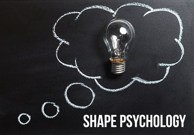
The Psychology of Shapes in Design
The most crucial aspect of logo design is the psychology of shapes, as it’s relevant for the entire creation process. The human mind tends to remember form more profoundly than other details, making logos that use geometrical shapes easy to remember. The logos used for Android, Apple, and the Olympics are just a few examples of easy to recognize forms.
However, this is not always the case. We subconsciously judge shapes based upon their characteristics. Curves, straight lines, and circles all carry different meanings and therefore evoke mixed reactions. Because of this, a designer can use this knowledge to their advantage to promote certain qualities a business has. Think of the Nike logo. The swoosh encourages the idea of movement, which is likely what the brand intends to do.
How a logo shape can send out a particular message
Round shapes like circles, ovals, and ellipses usually have positive emotional connotations. A circle often suggests a bond, like friendship, community, relationships, and unity. Therefore, rings imply marriage, which, on its own, suggests endurance and stability. Curvy shapes often come across as feminine.
On the other hand, straight-edged shapes like triangles and squares suggest the idea of stability and balance. The straight lines and precision usage in logos show efficiency and professionalism, as they are flawless. However, in combination with the color blue, these straight lines may appear to be cold and uninviting. Combining them with vibrant colors instead will solve this problem and create an exciting dynamic between color and shape.
Triangles can also be associated with science, religion, law, and power. These shapes tend to have masculine associations and are therefore often used with companies that focus on a male-dominated audience or niche.
The effects of the typeface in logo shapes
The type of typeface you choose has an impact on the form of your logo. Like we mentioned in an earlier blog, a font also has individual psychology to it. For example, a jagged and angular font will come across as more aggressive and dynamic, while rounded letters will appear to be more youthful. On that same note, a curvy typeface and cursive scripts often appeal more to women, while bolder fonts appeal more to men.
Before starting the creation process of a brand’s trademark, be sure of the values and attributes of your client’s company. Ask them nicely to provide you with all the essential information about their missions and values. Then, coordinate the colors and shapes used. Active forms go well with soft colors to tone down the masculinity when needed. Analyzing the industry your client works in will help you to paint a better picture of what kind of shapes and colors their logo needs.
When creating your business logo design, make sure that the shape is good enough to convey your brand’s message. Also, make sure to remember that each form carries a different meaning. So, a curvy trademark can say something entirely different than an angled one. Brands with a vertical, square, circle, or horizontal shape work best with business messages.
The psychology behind lines
The lines in a trademark have an impact on the way we judge them and how we perceive their message. Vertical lines often recall associations of strength and muscularity and, therefore, often suggest aggression. On that same note, horizontal lines convey a sense of calm and tranquility and seem to unite us.
These are some common shapes and their associations
· Verticals
Vertical lines convey the message of stability and balance, but they can also show strength in their products and services that a company provides. Vertical lines are ideal for promoting professionalism and competitiveness. Please note that the wrong usage of vertical lines may damage the image of your business as they can give off the wrong message. If you don’t intend to send out a message of aggressiveness or dominance, make sure to use those lines carefully.
· Horizontals
If you want to spread a message of tranquility, composure, community, and silence, then you should go for the horizontal lines. These lines have a soothing effect on our nerves and promote calm and order. Experienced graphic designers will, therefore, use horizontals when they need to encourage the trustworthiness of a brand. When a logo has many diagonal and vertical lines, a horizontal line will balance out the negative connotations.
· Curves
Whenever a curve appears in branding design, it often expresses feelings of comfort and positivity. Curved lines often get associated with friendship, protection, care, and love. A rainbow is an excellent example of this.
Do note that curves portray movement. An inverted curve will give a feeling of anger, sadness, or depression, while the opposite curve will display happiness and smiles.
· Circles
Circles are the most commonly used lines in logo design. The creators often use these to show endurance and partnership. Take a look at the Olympic rings with five circles. These all convey the message of unity and strength, bringing our countries together.
· Square And Rectangles
When you want to convey a message of balance and strength, squares and rectangles are the way to go. However, these lines can only appear in combination with proper coloring or shading. Otherwise, they will look dull and uninviting.
· Diagonals
If your company wants to show its dynamics, diagonals are perfect. Diagonal lines give a feeling of vibrancy to a logo, which makes it look memorable and unique. Too many diagonals, however, will make your company seem untrustworthy. Be careful with the usage of diagonals.
· Triangles
Due to their historical use, triangular forms are unique. You can find them in different cultures, religions, and sciences from all over the world. Professional creators use these lines to portray a business as masculine and dominant.
After reading this, it’s clear that branding creation contains a lot of psychological aspects in colors, shapes, fonts, and much more. A professional designer will consider the desired impacts on your viewers before starting the creation process.
If you’re thinking of designing a logo for your business, you can either do it yourself and with the help of this article, your job will be esier or hire someone else to do it for you. Eztuto Studio offers affordable yet personal designs to help you gain the most out of it.
Conclusion
Professional graphic designers will keep the psychological impact of the shapes, colors, lines, and fonts of your logo design in mind during the creation process. Every single element has a specific power to influence your audience. They work on our subconscious mind without us even knowing. Use this knowledge to your advantage and gain more customers.