The colors of your business tell its story. They are essential to your brand as they can both repel or attract your audience. Color combinations continuously change, so like with any other design elements, you need to be willing to change too! We’ve collected the seven latest color trends for this year. It doesn’t matter if you want to update your brand, or have just begun building your company, using these colors will help your company grow!
Table of Contents
Go For Bold!
When you look at pop music, artists are continually pushing the boundaries of our social norms. The modern design follows the same rules. As a designer, you’re an artist, so why not use this to your advantage and be bold!
If you’re daring enough, give your designs a bold twist in the start, middle, and end. Use highly saturated colors to make it look tropical and vibrant. Make part of an image stand out by using a completely different shade.
Bold colors are not for the meek. It would be best if you were 100% sure to use them. Otherwise, it will seem like you are not entirely behind your product. Please pay attention to your brand and its personality and find a suitable style.
Candy Red
Red is a noticeable and firey color; using it in your business design will give it a big aesthetic boost. Red used to appear in overall tame palettes, but now we don’t need to conform to those rules anymore. Large palettes with bright colors scream energy and passion. Who doesn’t want that?
Candy red will give your business the boost it needs to become memorable which makes it on of the powerful 2020 color trends. However, please keep in mind that your message needs to coincide with the colors. Otherwise, it will lose its value.
Saturation
We all love exposure and depth. Heavy saturation is both that and more. From moody colors to vivid tints and hues, your brand needs color in 2020.
You can use this knowledge however you like, whether it’s one vibrant color in an otherwise black and white palette, or a landscape full of contrasting elements. Giving your audience a visual creative experience will keep them wanting more. Make sure you pick the right color before publishing your new design. It will have to stay for a while.
Precise contrast
Contrast is an essential tool to use in 2020. It’s versatile, and you can use it for both font combinations and colors. Many professional artists stand out with the most unexpected combinations.
While there are plenty of ways to create contrast, one small miscalculation can lead to an off-putting sight. To stay in the safe zone, stick to colors on one end of the spectrum each. A well-done contrast will give your design a dynamic and energetic feel.
Use earthy tones
A rustic cottage in the middle of a forest, a misty meadow with a few cows walking around. How do these examples make you feel? Perhaps they bring you back to the childhood holiday you once had, or maybe it’s something that calms you during stressful times.
Now, focus on your emotions. They are the same emotions your audience will feel when you present them with earthy tones in your company design. Nature makes us feel cozy, safe, and nostalgic. Using this knowledge to your advantage, you can seriously boost your traffic.
Look into muted colors like green, blue, and brown, primarily if your company focuses on ecological items/services. Be subtle as it enhances the effects, so feel free to use multiple understates hues to create a smooth finish.
No more less, be extra!
When designing products, people tend to stick to the “three-color” rule as using more colors can overwhelm the viewer. However, since 2020 is about breaking the rules, why not break this one?
More and more people are throwing all kinds of colors around, which ends up making a welcoming and fun brand. However, clashing colors can prevent your company from growing to please keep updated with the current color theories before starting the creation process. A smart piece of advice is to stick with colors of similar brightness or one single hue with different saturations.
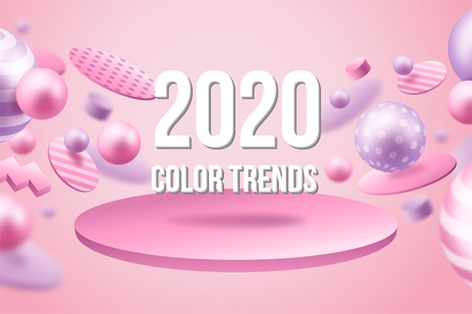
2020 Color Trends – Gradients
People view gradients as outdated or childish. Think back to the popular WordArt themes with varying gradients. However, gradients are back in fashion again! Just take a look at Spotify’s microsites.
Using a various amount of hues to your project with an added gradient in the background will increase the depth of your image.
Gradients are also helpful when you want to lay focus on a 3D element. Beware of the color blend, non-matching hues can make a design look clumsy and cluttered. Shades that are close together in color will make your project look much smoother.
Your task this year
There is never one perfect way to design your brand, whether it’s an upgrade or a new company. Still, there are plenty of wrong ways to try! Therefore, it’s essential that you try and experiment with new ideas. That way, you will see which ones are successful and which ones are not. You decide which approach works best for you and which one portrays your personality best. Make 2020 the year of color trends in your design!