![]()
What’s up with your logo colors meaning? Picking a logo for your business is almost as important as picking its name. Which hues you use can make or break your brand. However, many people still overlook this important factor when it comes to your brand identity design. That’s very odd, considering that the colors are the first thing people notice about your brand.
When we look at a color, we often have associations attached to it. They have emotional power over us. So, picking the right hues can significantly affect your branding methods and increase the positive associations your customers have.
Take a look at some famous brands and their colors.
- Green: Animal Planet, BP
- Yellow: Nikon, McDonald’s
- Red: Shell, H&M
- Pink: Lift, Barbie
- Purple: Yahoo, Cadbury
- Blue: Flickr, Dell, Ford, Twitter
These companies do not have a common ground, but they still use the same hues. The reason behind this is that specific colors have a particular meaning. We will get into that later.
Table of Contents
The psychology behind color design
When you’re a graphic designer, you’ve probably come across a few clients that demand a specific hue for their design without knowing the associations and consequences.
To prevent a temper tantrum from them, you can choose two things.
- You stay silent and use their color of choice
- You educate them on the hidden meanings
The most effective option is the latter, of course. However, it may take longer than the first option. Graphic design is about what works, not about your personal preference. While you should agree with the chosen design, your opinion should not overrule psychologically proven facts. In the end, it’s about your audience, not about you.
What associations do you want to invoke? How do you want them to remember you? This decision isn’t a simple choice, like picking a color for your bedroom walls. Your companies future depends on it.
Before we see an image or some beautiful paired fonts, our brain has already subconsciously registered the hue. This process is incredibly fast. One single image can provide so much more information than a text or sound can. Your brain and eyes process this information far quicker than your other senses can. As you can see, color is the second thing we notice when we look at something just after shapes. From this, we can conclude that hue is more important than content when it comes to your logo design. When you use the right colors, you can increase your branding and marketing method’s success tremendously.
What colors tell you about your brand
As we mentioned above, hues have a significant impact on people and can evoke all kinds of emotions when used right. However, these associations are subjective. The response your audience has to specific colors comes from their life experience and cultural associations. Still, there are a few primary associations for each hue. Here are a few of them:
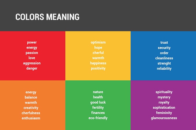
- Red: passion, love, power, aggression, danger
- Orange: warmth, energy, balance, creativity, enthusiasm
- Yellow: happiness, positivity, joy, hope, optimism
- Green: nature, fertility, growth, luck, finances, ecological
- Blue: security, trust, authority, cleanliness, order, reliability
- Purple: riches, mystery, spirituality, glamour, sophistication
You can always combine hues to form a double meaning, but they have to differentiate you from the rest of the competition. If you want to be truly successful, you need to “own” a color. Since this is close to impossible if you don’t already have an established business, you may want to look into the next topic.
How to pick the right color scheme for your design
When you see the word “Coca-Cola,” you instantly know which hues this brand uses. The same goes for Facebook, UPS, Starbucks, and Apple. Their core brand has its best logo colors, and by seeing them, we instantly know what brand it represents.
In a recent study, Dr. Gemma Calvert found that the same brain activity patterns appeared when people viewed images of big corporations like Harley Davidson, Apple, Ferrari, and others, as when they saw religious pictures. That only shows how powerful brands are.
Hue also plays an essential aspect of marketing. You could look at an image of a glass of coke with a red background and instantly know it’s Coca-Cola, while Pepsi also sells coke. The reason you know this is due to the brand hues. Pepsi uses red and blue, while Coca-Cola uses red only.
There is a clear link between brands and colors. This link is because hues can convey messages and meanings without any need for words. Many of the most popular brands rely on colors for the presentation of their product.
How to create a colorful logo design
Before we start, there are multiple ways in which you can specify colors:
- Hues: the actual color, like red, green, blue, and so on.
- Saturation: how much grey color contains
- Brightness: refers to the amount of black or white that’s mixed in with the color
When you combine multiple hues, you need to make sure that they are in line with the Web Content Accessibility Guidelines. If not, then the chances are that they do not combine well and will repel customers. There are a few tools that can help you find the best combinations. The most common one is Adobe’s Color Scheme Generator: color CC. Colorable helps you with the Web Content Accessibility Guidelines, and Pantone’s Studio App converts photography into color swatches. The latter is very helpful if you want to create a realistic-looking painting/design.
You need to be careful when picking a hue. Not only do you have to build brand awareness, but you also need to differentiate yourself from other businesses. To do so, you need to familiarize yourself with the color theory. This theory explains how hues form and what the relationship between hues is. When you understand this, you can use color more effectively in your graphic designs.
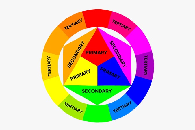
In short, color theory has three different categories of hues.
- The primary colors: red, blue, and yellow
- The secondary colors: orange, purple, and green
- The tertiary colors: teal, violet, magenta, vermilion, amber, and chartreuse
To pick the best hues, you need to have a clear vision of the message you want to convey. Which emotions do you want to evoke? Your brand hues meaning needs to be consistent and have to stand out on the web. Use this knowledge wisely.
Then, you need to pick a saturation or brightness. Usually, feminine-perceived brands use lighter colors than a manly-perceived brand.
What are the best color combinations?
Each color combination has an impact on its readability, eye-strain, catching your attention, and the ability to be seen at night. These characteristics are something to keep in mind when picking colors for your brand. Since you will probably advertise yourself as much as possible, your brand needs to be visible in all kinds of circumstances.
There are two ways to group colors:
- Analogous colors: hues of the same tone, but with different saturations and brightnesses.
- Triadic colors: hues with a prominent contrast
When you use a color wheel, you can instantly see which colors complement each other, and which ones are analogous. Each color has its own family to support a vast range of needs.
Some colors unify an identity, while others clarify a brand’s architecture by differentiating between different business lines and products. When forming a brand, choose brand architectural colors.
Let’s have a look at FedEx. The primary logo contains the colors purple and grey. Each specific branch, like ‘express,’ ‘freight,’ and ‘office,’ combine purple with another color. These other colors show the customer instantly with what branch they are dealing with. When you use this consistently, you will quickly build a more significant brand identity. Make sure that the digital and print versions of your brand are consistent in color. You can do so by checking the following:
- Emission colors: the object emits light, like LED-displays
- Reflection colors: the object reflects light, like painted surfaces
In digital versions, we use RGB (the additive theory), while we use the CMYK system (the subtractive theory) in print.
Additive colors are so-called “pure” colors, which means that when you add all colors, you will create white light. A red spotlight looks red since it emits red light.
Subtractive colors, on the other hand, are “impure.” The red paint looks red because it only reflects red lights and absorbs all the rest.
RBG vs. CMYK
While in theory, these colors are all the same. When you switch between RBG and CMYK, the colors may look different. Since the RBG and CMYK spectrums are different, color may look bright on your computer screen, but pale on paper.
The Pantone Color Palette allows you to use the same color in both digital versions and print.
All in all, this article gives a better insight into logo colors meaning, why we use them, and why they are so crucial for your business marketing. There is plenty more material to find on colors, but we have to end our article somewhere before we hit a 200-page book. If you want to learn more, keep an eye out for future blog posts on Eztuto Studio about colors and color psychology.